
Infographics with ChatGPT: The Perfect Prompt (Part 1)
Learn how to create editorial-quality educational infographics with a single ChatGPT prompt. Step-by-step guide with a ready-to-use template.
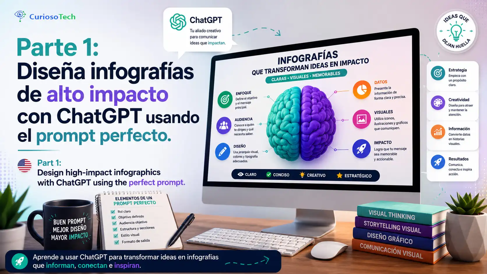
You’ve spent hours in Canva dragging text boxes around, hunting for matching icons, and nudging margins pixel by pixel. The result: an infographic that looks… fine. Nothing you’d proudly share.
Meanwhile, you keep seeing infographics on social media that look straight out of a National Geographic feature — hyperrealistic 3D renders, floating data cards, flawless typography. And you wonder: how do they do it?
The answer is simpler than you think. They do it with a single well-crafted prompt in ChatGPT. And today you’re going to learn exactly how.
Why AI-Generated Infographics Are Taking Over Social Media
Infographics have always been the king of educational content. They condense complex information into something visual, memorable, and shareable. But creating them from scratch used to require graphic design skills, expensive tools, and — let’s be honest — a lot of time.
With the evolution of image generation models built into ChatGPT (DALL-E 3 and its successors), anyone can produce editorial-quality infographics by writing the right instructions. No Photoshop. No design subscriptions. No prior experience.
The secret isn’t the tool. It’s the quality of the prompt.
A generic prompt like “make an infographic about the solar system” will give you a generic result. But a structured prompt with precise technical specifications — format, visual style, hierarchy, typography, lighting — produces results that rival the work of a professional design team.
Anatomy of the Perfect Prompt for Educational Infographics
The prompt you’re about to learn follows a modular structure. Each section controls a specific aspect of the final output. Understanding why each part exists lets you adapt it to any topic — from biology to programming, from history to electronics.
The Base Instruction: Format and Style
Everything starts by defining exactly what you want:
Design a premium infographic in vertical 9:16 format (1080 × 1920),
"Educational Science Explainer" style, editorial-level, modern and
highly visual about [TOPIC NAME].
This opening line establishes three critical parameters:
| Parameter | Value | Why It Matters |
|---|---|---|
| Format | Vertical 9:16 (1080 × 1920) | Optimized for Instagram Reels, TikTok, YouTube Shorts, and Stories |
| Style | Educational Science Explainer | Directs ChatGPT toward a scientific, educational aesthetic — not artistic |
| Level | Editorial premium | Pushes the output quality above generic results |
The Subject as the Visual Protagonist
The subject must be the absolute protagonist, placed at the center of
the composition with a hyperrealistic 3D render, anatomically correct,
with ultra-detailed textures, cinematic studio lighting, physically
realistic materials (PBR), soft shadows, and maximum sharpness.
Here you tell the model that the central topic isn’t just another design element — it’s the star. Technical terms like PBR (Physically Based Rendering), cinematic lighting, and ultra-detailed textures are instructions the model understands and applies directly to the render.
Key insight: Including 3D rendering terminology in the prompt isn’t decorative. Models like DALL-E and those integrated into ChatGPT are trained on image descriptions that use exactly this vocabulary. The more precise you are, the more control you have over the output.
The Complete Prompt: Ready-to-Use Template
Below is the full prompt, section by section. Simply replace [TOPIC NAME] with your infographic subject and paste it into ChatGPT.
Section 1 — General Design
General Design
• Clean, minimalist, and professional layout.
• Aesthetic inspired by high-quality science magazines, National Geographic,
  science museums, and premium educational infographics.
• Excellent visual hierarchy and balance between image and information.
• Plenty of white space to improve readability.
• Light and elegant background with subtle gradients or very discreet
  scientific patterns.
• 8K quality, ultra HD.
This section acts as the global art direction. Each point prevents common mistakes: cluttered backgrounds, visual overload, lack of hierarchy. “White space” is especially important — without it, infographics become unreadable on phone screens.
Section 2 — Header
Header
At the top include:
• A large and eye-catching title.
• Scientific name in italics.
• A short subtitle with an interesting description.
• A small icon related to the topic.
The header is the first thing the viewer sees. A large title paired with a descriptive subtitle and a thematic icon immediately establishes what the infographic is about and sparks curiosity to keep reading.
Section 3 — Central Zone
Central Zone
Place the subject occupying approximately 55–65% of the visual space.
Add visual indicators highlighting important features using:
• elegant thin lines,
• reference points,
• minimalist labels,
• discreet arrows.
Everything perfectly aligned.
Here you define that the subject visually dominates the composition. The 55–65% range is intentional: enough to make it the protagonist, while leaving room for the information panels without competing for attention.
Section 4 — Information Panels
Information Panels
Distribute around the subject between 4 and 6 floating cards with:
• rounded corners
• translucent white background
• slight shadow
• modern vector icons
• mini illustrations
• simple diagrams
• very clean graphics
Each card must contain only one main idea.
Floating cards are the informational heart of the infographic. The one idea per card instruction is essential: it prevents cognitive overload and ensures each data point is processed independently.
You can customize the card content based on your topic. Some examples:
- Animal or plant: Habitat, diet, size, fun facts, life cycle, distribution
- Technology: Specs, advantages, use cases, comparisons, history, future
- Scientific concept: Definition, applications, discovery, formula, experiments, data
Section 5 — Expert Character
Expert Character
Add a small character in semi-realistic 3D illustration style
(biologist, scientist, explorer, or researcher).
The character should appear interacting with the subject:
• pointing with a pointer,
• using a digital tablet,
• holding a magnifying glass,
• taking notes,
• observing with curiosity.
It should add dynamism without stealing the spotlight.
This element is subtle but powerful. A human character emotionally anchors the viewer. It transforms a technical image into something that feels like a personal explanation. The “without stealing the spotlight” instruction prevents the model from giving the character too much visual weight.
Section 6 — Bottom Strip
Bottom Strip
Create a bottom section with:
• Quick facts
• Relevant statistics
• Visual comparisons
• Size scales
• Informative icons
• Numerical indicators
• Small comparative cards
Everything perfectly organized.
The bottom strip works as the closing punch. Quick numerical data, scale comparisons, and statistics give the viewer one final dose of information that consolidates what they’ve learned and — most importantly — motivates them to share.
Section 7 — Visual Style and Quality
Visual Style
• Editorial premium
• Modern scientific infographic
• Pixar + National Geographic + Apple Design + Science Museum
• Harmonious colors related to the subject
• Vibrant accents only to highlight important information
• Excellent contrast
• Very easy to read even on mobile devices
• Elegant and futuristic design

Quality
• Ultra detailed
• Extreme photorealism
• High-end 3D render
• Cinematic lighting
• Global illumination
• Ambient occlusion
• Sharp focus
• HDR
• 8K
• Premium composition
• Perfect typography spacing
• Professional infographic
• Award-winning editorial design
• Viral social media quality
This is the section that separates an amateur result from a professional one. The references to Pixar, National Geographic, and Apple Design give the model a concrete aesthetic framework. The technical rendering terms (global illumination, ambient occlusion, HDR) dramatically elevate the visual quality of the output.
Section 8 — Constraints
Constraints
• No unnecessary elements.
• No visual saturation.
• No text overlapping the main subject.
• Avoid garish colors.
• Maintain a perfectly balanced composition.
• Prioritize readability and clarity of information.
• Aspect ratio 9:16 optimized for YouTube Shorts, TikTok, and Instagram Reels.
Constraints are just as important as positive instructions. Without them, the model tends to overload the image with decorative elements, invasive text, and competing colors. This section acts as a quality filter.
Download the Complete Prompt as a PDF
So you don’t have to copy section by section, we’ve prepared the complete prompt in a single PDF document ready to download, save, and reuse whenever you need it.
Download the complete prompt as PDF
Open it, replace [TOPIC NAME] with your subject, and paste it straight into ChatGPT. That simple.
How to Use the Prompt Step by Step
Applying this template is more straightforward than it seems. Follow these steps:
- Open ChatGPT (version with image generation enabled)
- Copy the complete prompt from the sections above into a single message
- Replace
[TOPIC NAME]with your subject — for example: “the ruby-throated hummingbird,” “the water cycle,” or “the architecture of a CPU” - Customize the cards based on what you want to highlight about your topic
- Adapt the expert character to your context: a biologist for nature, an engineer for tech, a historian for historical topics
- Send the prompt and wait for the result
- Iterate if needed — request specific adjustments: “make it cleaner,” “reduce the character size,” “switch to cool-toned colors”
Pro tip: If the first result isn’t exactly what you’re looking for, don’t rewrite the entire prompt. Ask for targeted adjustments in the next message. ChatGPT maintains context and applies incremental corrections with better results than starting from scratch.
Practical Examples: Same Prompt, Different Topics
To see the kind of result you can achieve, here’s an infographic generated with this prompt about “Respect.” Click the image to see it in full detail:
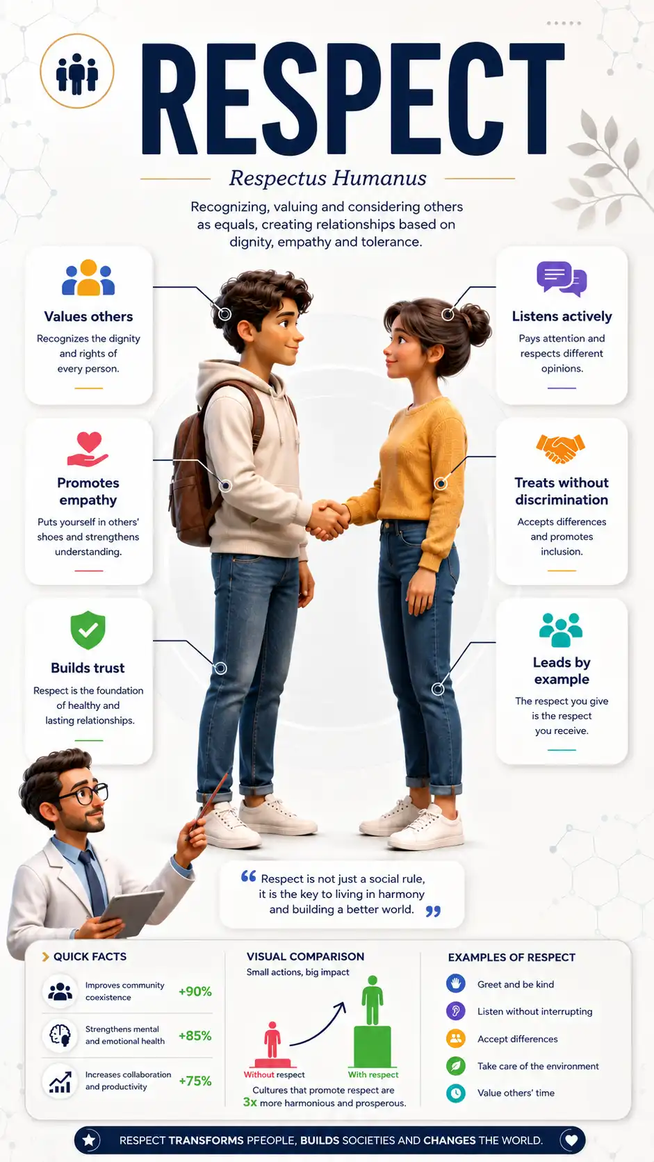
Real example: infographic generated with the complete prompt from this article.
The true strength of this prompt is its versatility. It works with any topic that needs a visual explanation:
| Topic | Suggested Expert Character | Suggested Cards |
|---|---|---|
| Great white shark | Marine biologist in diving gear | Size, speed, diet, habitat, senses, conservation |
| Solar energy | Engineer with helmet and tablet | Efficiency, cost, installation, panel types, environmental impact |
| Human DNA | Geneticist in lab coat | Structure, function, mutations, gene therapy, numerical data |
| Arduino Uno | Maker with soldering iron and magnifying glass | Specs, pins, projects, comparison, compatible sensors |
| Solar system | Astronomer with telescope | Planets, distances, temperatures, fun facts, exploration |
If you’re looking for inspiration for Arduino or ESP32 projects, SriTu Hobby has hundreds of step-by-step tutorials you could complement with an infographic generated using this method.
Common Mistakes That Ruin the Result (and How to Avoid Them)
Even with a solid prompt, there are pitfalls that can degrade your infographic quality:
- Prompt too short: Writing “make an infographic about X” gives the model total creative freedom — and that rarely produces professional results. Specificity is your ally.
- Not defining the format: Without exact dimensions (1080 × 1920, 9:16), the model will generate inconsistent proportions that look bad when shared on social media.
- Skipping the constraints: Without the constraints section, the model tends to add unnecessary decorations, text over the main subject, and distracting colors.
- Requesting too many changes at once: If you need adjustments, ask for them one at a time. “Change the colors, reduce the text, move the character, and add a card” confuses the model. Be surgical.
- Ignoring mobile readability: 80% of people will see your infographic on a phone. If the text is too small or the contrast is low, you lose your audience.
Limitations You Should Know About
Being honest about what this technique can and can’t do will save you frustration:
- Generated text isn’t always perfect. Image models still make typos or coherence errors in longer text. Always review the text inside the infographic and, if needed, correct it manually in an image editor.
- Data can be fabricated. ChatGPT may include statistics or facts that look real but aren’t. Verify all factual information before publishing.
- Consistency between infographics is hard. If you need a series with the same visual style, each generation may vary. Consider using seeds or very detailed style descriptions to maintain coherence.
- It doesn’t replace a designer for critical projects. For corporate branding, peer-reviewed scientific publications, or high-resolution print material, a professional designer is still the best choice.
What’s Coming in Part 2: Animating Your Infographic with Gemini
So far, you have everything you need to create professional-grade static infographics with a single prompt. But what if you could bring them to life?
In the next article — “Part 2: Bring Your Content to Life: The Secret to Animating Infographics with Gemini” — you’ll discover how to take the infographic you just created and turn it into a fluid animation ready to publish as a video on YouTube Shorts, TikTok, or Instagram Reels.
Imagine your great white shark infographic with the cards appearing one by one, the scientist character pointing at each data point, and the subject smoothly rotating in 3D. That’s exactly what you’re going to learn.
Don’t miss it — stay tuned for Part 2, coming soon here on CuriosoTech.
Your First Professional Infographic Is One Prompt Away
Creating high-impact visual content no longer requires mastering complex design tools or spending hours on manual adjustments. With the structured prompt you just learned, you have a proven, adaptable template that turns any topic into an editorial-quality infographic.
Copy the prompt, pick your topic, paste it into ChatGPT, and be amazed by the result. And once your first infographic is ready, gear up for Part 2 — where the real magic begins.
Already tried the prompt? Tell us what topic you chose and how your infographic turned out.